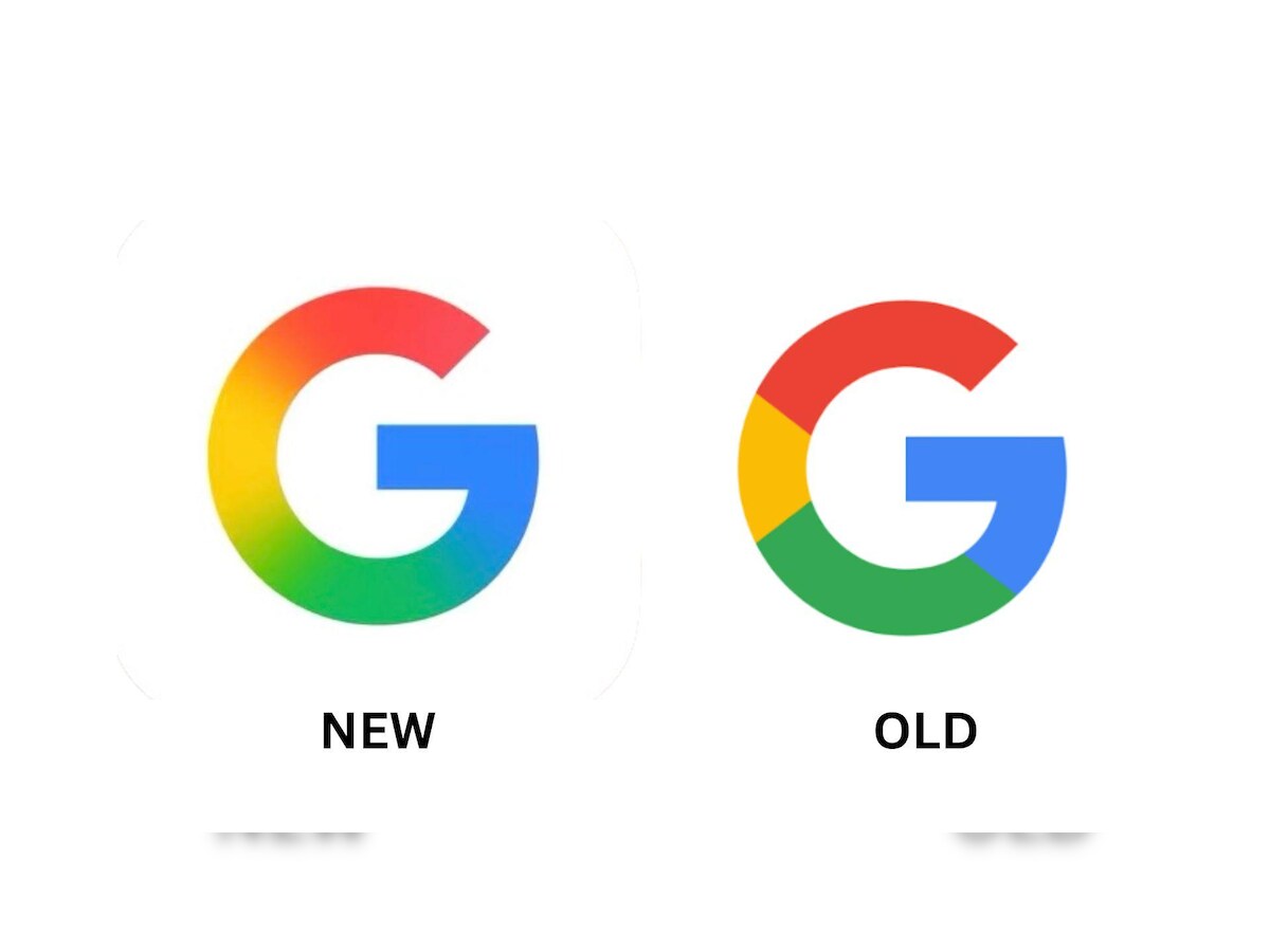
Tech giant Google has unveiled a new logo design, sparking mixed reactions from users, designers, and branding experts around the world. The update — described by Google as a “refined evolution” of its visual identity — features a bolder typeface, softer color tones, and improved legibility across digital platforms.
According to The Verge (Nov. 5, 2025), Google stated that the redesign aims to improve visibility on smaller screens and align with its broader focus on AI-driven products and cross-platform coherence. However, while some praised the minimalist look, others accused the company of “rebranding fatigue” and unnecessary changes that add little to user experience.
TechCrunch reported that the new logo rollout began quietly across Google Search, Gmail, and the Android interface earlier this week. Several users on X (formerly Twitter) expressed confusion, noting that the logo looks “almost identical” to the previous version, with only subtle shifts in letter thickness and color gradient.
Wired highlighted that design professionals are divided: some argue the refresh reflects modern simplicity, while others believe Google’s branding has become “too sterile” and “corporate”, losing the playful charm of its earlier aesthetics.
Meanwhile, BBC Technology noted that this marks Google’s first major visual change since 2015, when it transitioned from its serif logotype to a flat, sans-serif design — a shift that symbolized its evolution from a search engine to a multifaceted global tech ecosystem.
Sources
The Verge — “Google Unveils Refined Logo Design for the AI Era,” Nov. 5, 2025
TechCrunch — “Google’s New Logo Rolls Out Across Apps, Users Divided,” Nov. 5, 2025
Wired — “Designers Split Over Google’s Latest Logo Refresh,” Nov. 5, 2025
BBC Technology — “Google Updates Iconic Logo for the First Time in a Decade,” Nov. 5, 2025

